Branding08 / 11
Fornello
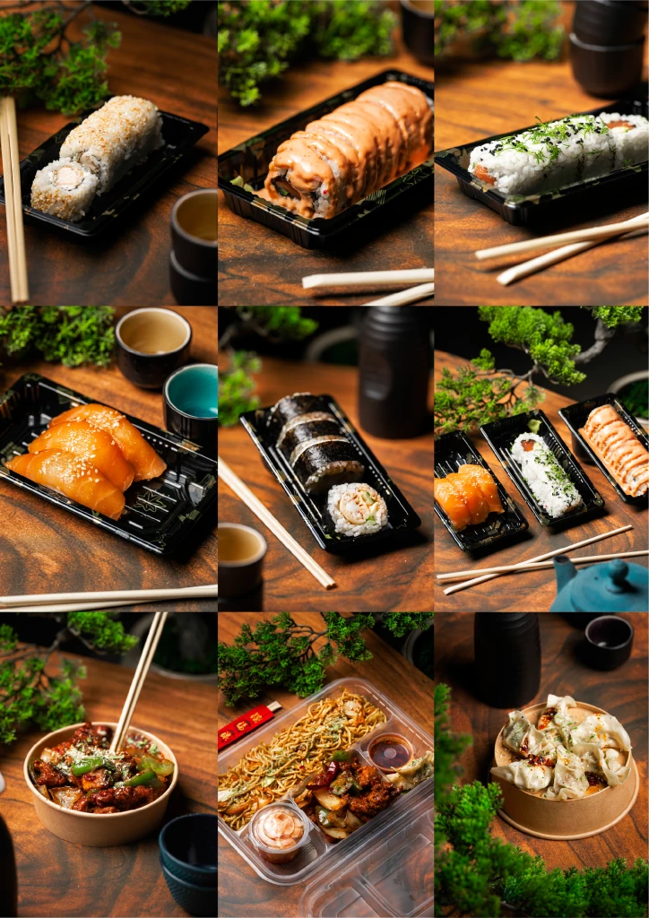
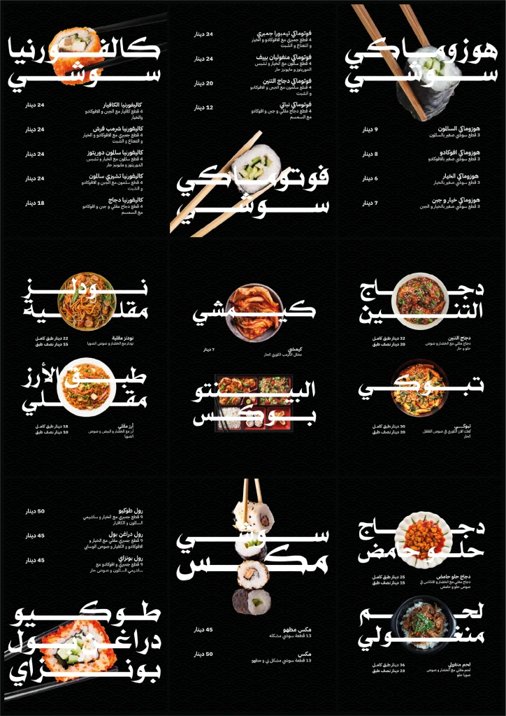
A new chapter, unmistakably Fornello.
The story
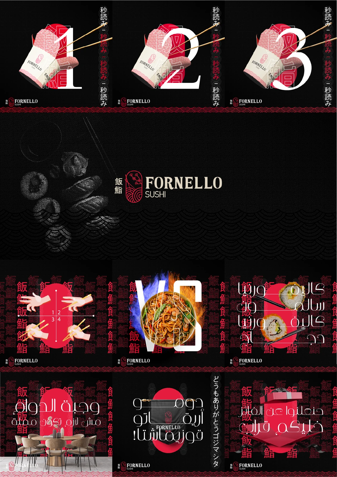
A renewed restaurant identity shaped by Japanese visual references and the story of a reopening.
- Client
- Fornello
- Focus
- Branding
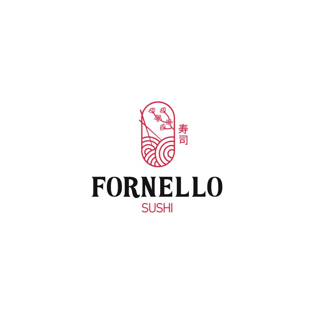
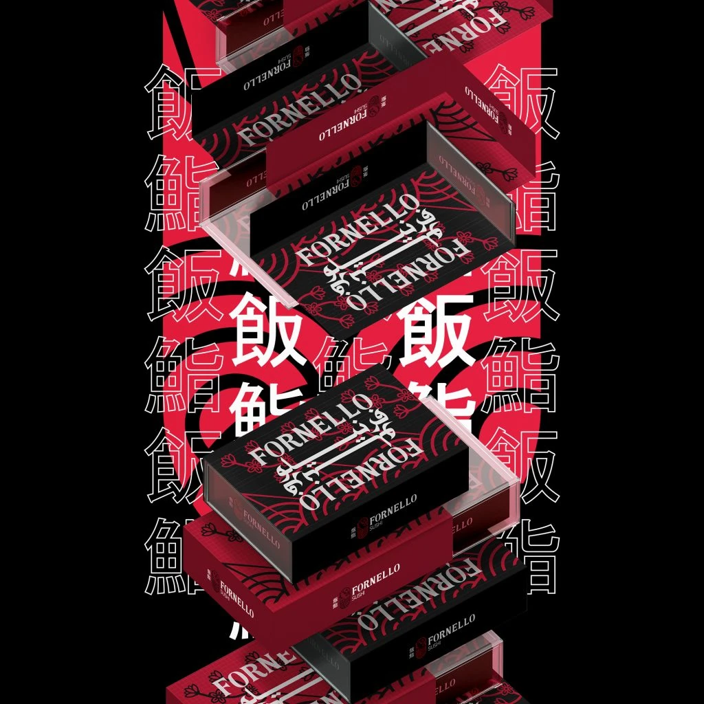
The logo brings together a Hanko-inspired seal, a lotus flower and sushi with chopsticks. The seal expresses a distinctive name; the lotus marks renewal.
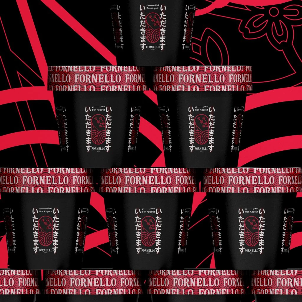
Red, black and white complete the identity, drawing on Japanese cultural references to express strength and stability.